
Interior Paint Colour Trends for Indian Homes (2026): What's In, Room by Room, and How to Actually Use Them
The 2026 interior colour trends for Indian homes — warm neutrals, sage green, terracotta, dark accent walls — with room-by-room picks and how to use each without regret.
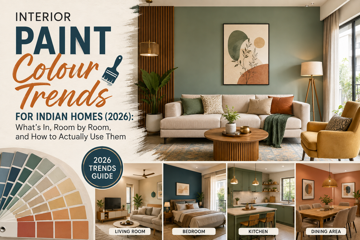
The biggest interior paint trend for Indian homes in 2026 is a shift to warm neutrals — greige, almond cream, warm off-white and soft mushroom grey — replacing pure white and cool grey. Nature-inspired greens (sage, olive, emerald) dominate bedrooms and living rooms; terracotta and earthy red-browns add warmth; and muted, dusty blues replace bright blues. Dark accent walls (forest green, charcoal) are popular, but used on one wall, not four. In small rooms, stick to light, receding shades and reserve bold colour for a single feature wall.
Interior colour trends for Indian homes in 2026 centre on warmth and nature. Warm neutrals — greige, almond cream, soft walnut, warm off-white, mushroom grey — are replacing pure white and cool grey as the dominant base, pairing well with wood furniture and Indian décor. Nature-inspired greens (sage, olive, moss, deep emerald) are the standout trend, especially for bedrooms, valued for calm; terracotta and earthy red-browns bring warmth to feature walls; muted, dusty, grey-based blues replace bright blues; and pastels expand beyond kids' rooms into living areas. Dark accent walls (forest green, charcoal, navy) add depth but work best on a single wall with three lighter walls — painting all four dark makes a typical room feel cave-like. Finish matters as much as colour: eggshell and satin suit most interior walls for durability and easy cleaning. Major brands' 2026 palettes (Asian Paints Colour of the Year, Birla Opus pastels, JSW Halo earthy tones) all lean nature-inspired. The practical rules: light receding colours make small rooms feel bigger, always test a sample patch in the room's own light, and pair trend colours with eco-friendly low-VOC paints.
The Big Shift In 2026: Warmth
If one word sums up 2026's interior colours, it's warmth. The cool greys and stark whites that dominated the last few years are giving way to warm neutrals and nature-inspired tones — colours that make a home feel grounded, calm and welcoming rather than sleek and clinical.
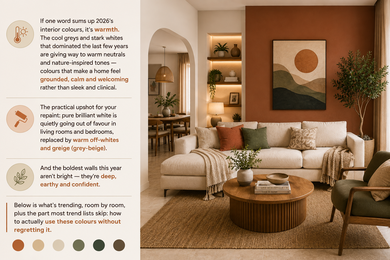
The practical upshot for your repaint: pure brilliant white is quietly going out of favour in living rooms and bedrooms, replaced by warm off-whites and greige (grey-beige). And the boldest walls this year aren't bright — they're deep, earthy and confident. Below is what's trending, room by room, plus the part most trend lists skip: how to actually use these colours without regretting it.
The 2026 Palette At A Glance
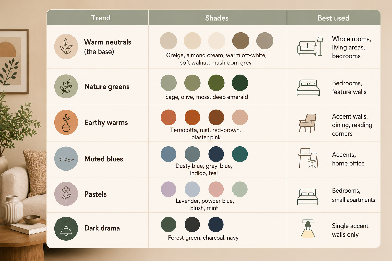
| Trend | Shades | Best used |
|---|---|---|
| Warm neutrals (the base) | Greige, almond cream, warm off-white, soft walnut, mushroom grey | Whole rooms, living areas, bedrooms |
| Nature greens | Sage, olive, moss, deep emerald | Bedrooms, feature walls |
| Earthy warms | Terracotta, rust, red-brown, plaster pink | Accent walls, dining, reading corners |
| Muted blues | Dusty blue, grey-blue, indigo, teal | Accents, home office |
| Pastels | Lavender, powder blue, blush, mint | Bedrooms, small apartments |
| Dark drama | Forest green, charcoal, navy | Single accent walls only |
Major brands' 2026 palettes all lean into this nature-inspired direction — Asian Paints' Colour of the Year, Birla Opus pastels and JSW Halo's earthy tones all point the same way.
Room By Room
Living room — warm and social
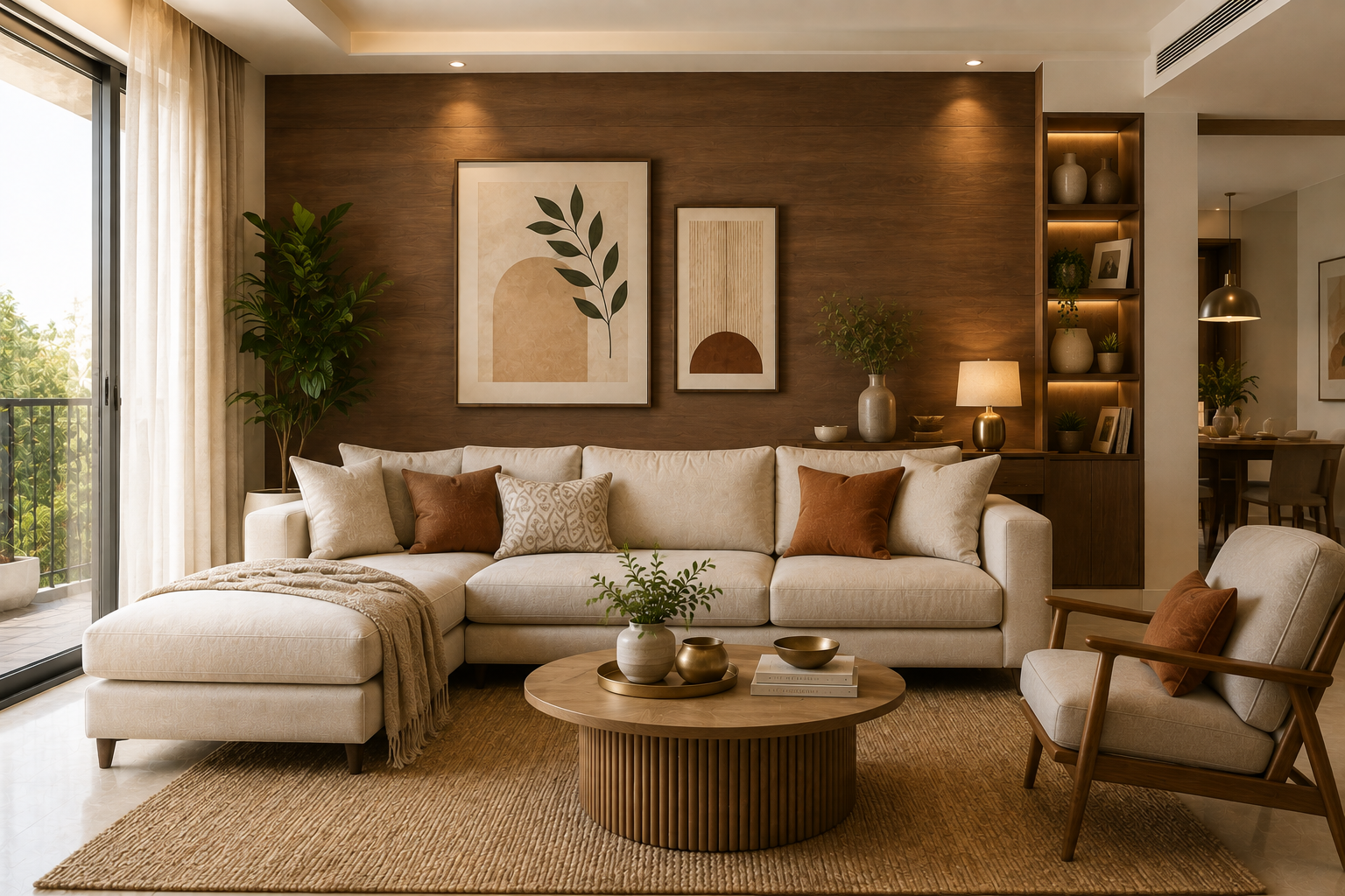
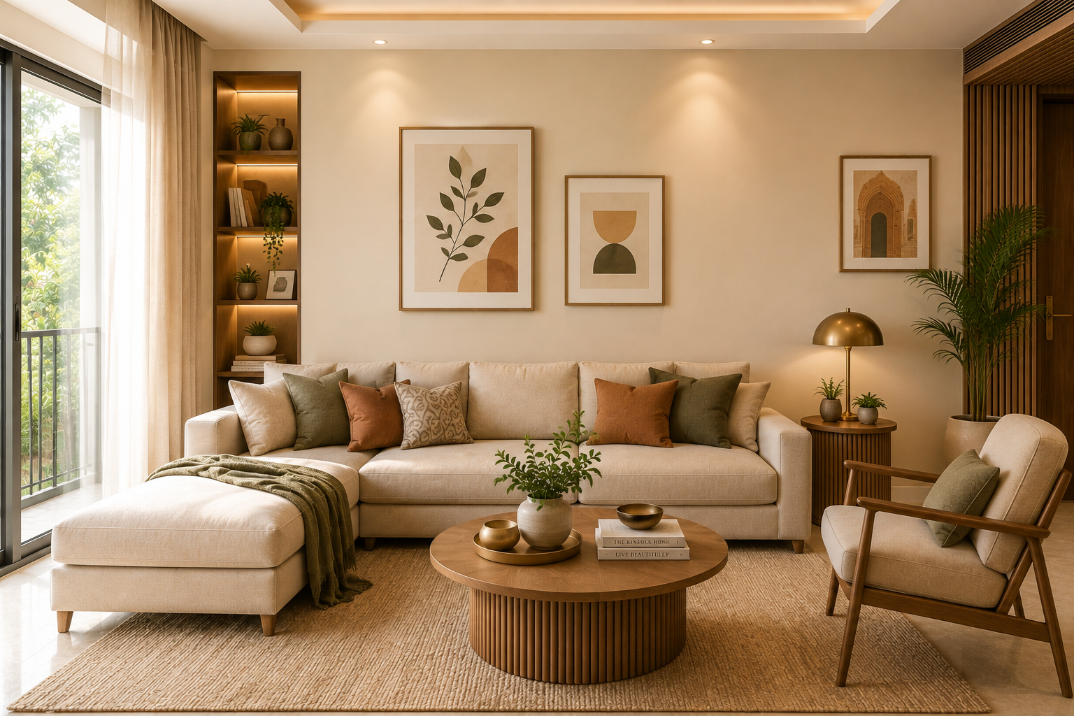
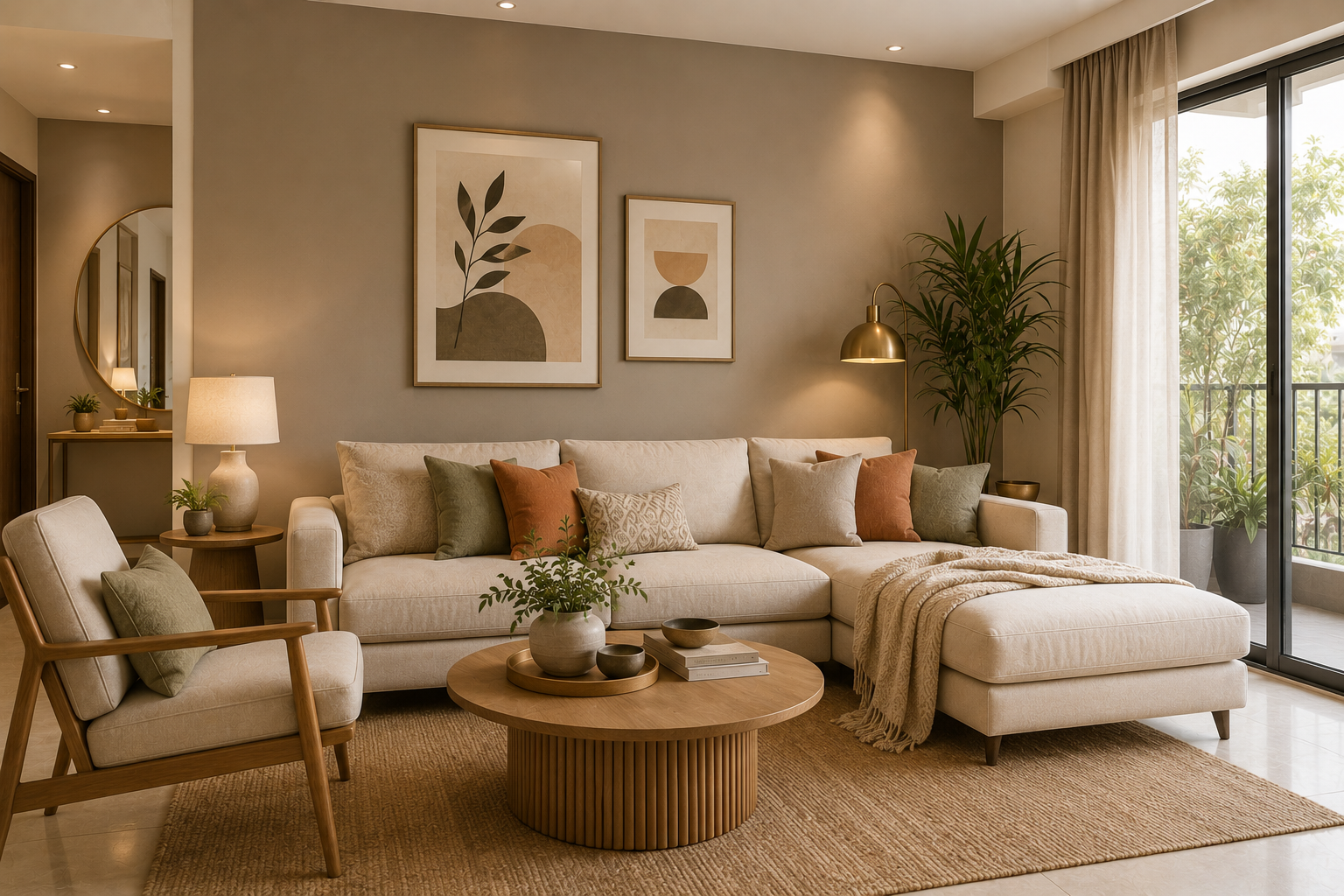
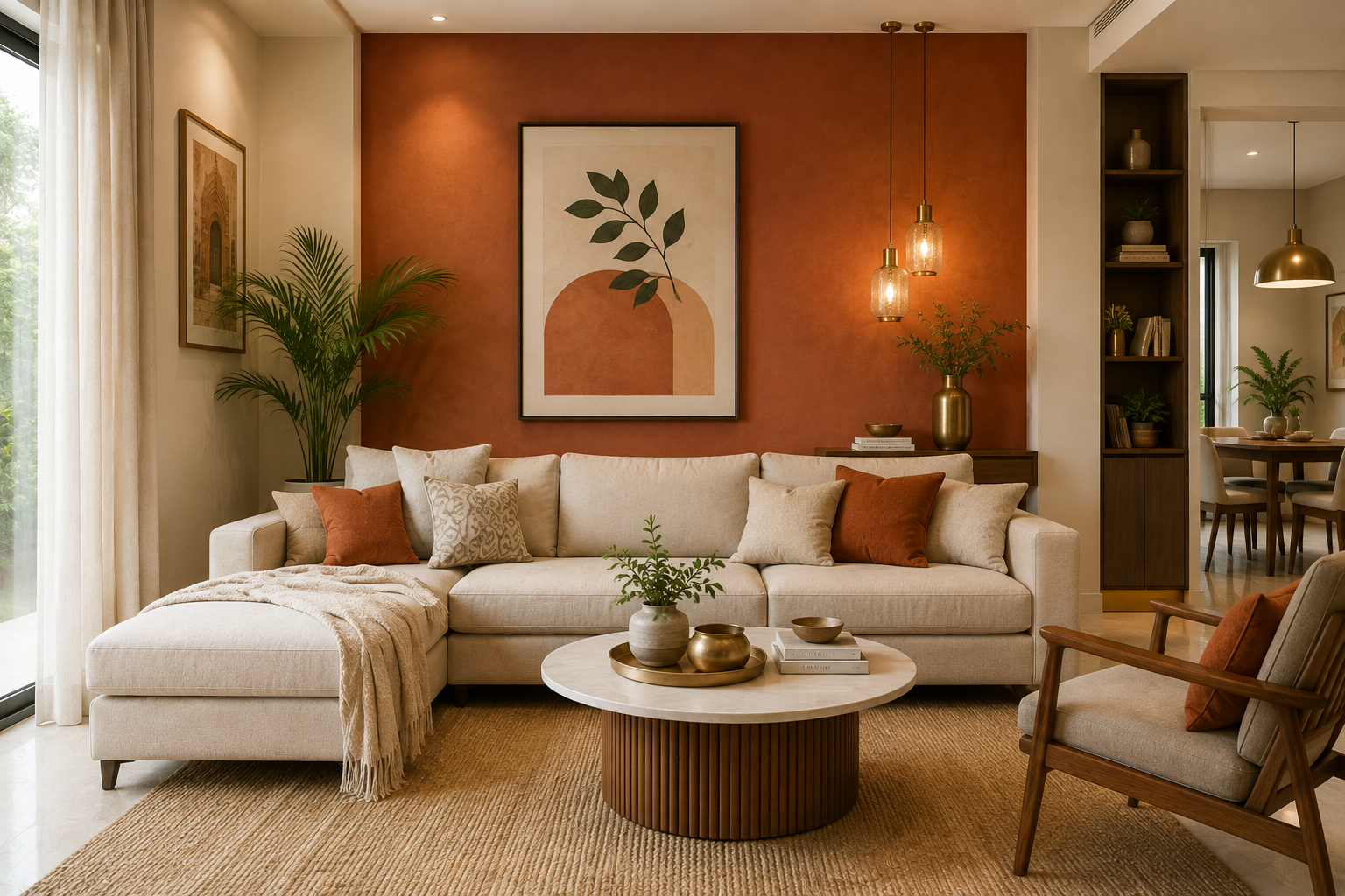
neutral-living-room-2026
Living rooms in 2026 prioritise a bright-by-day, intimate-by-evening feel. Luminous warm neutrals (greige, warm off-white) create an airy, expansive social hub that works from morning light to evening gatherings.
For a feature wall behind the sofa, the standout choices are deep emerald green (pairs beautifully with gold or brass accents for a luxurious, nature-inspired focal point) or terracotta for Indian warmth.
Bedroom — restful and restorative
The bedroom trend is calm. Nature-inspired greens — sage, grey-green, olive — are the bedroom colours of 2026, valued for a soothing, restorative feel that helps you wind down. They pair gorgeously with wood tones and natural textiles.
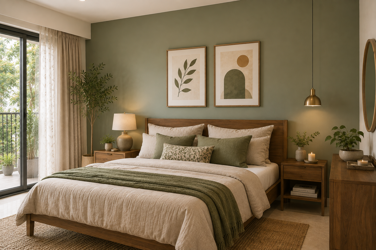
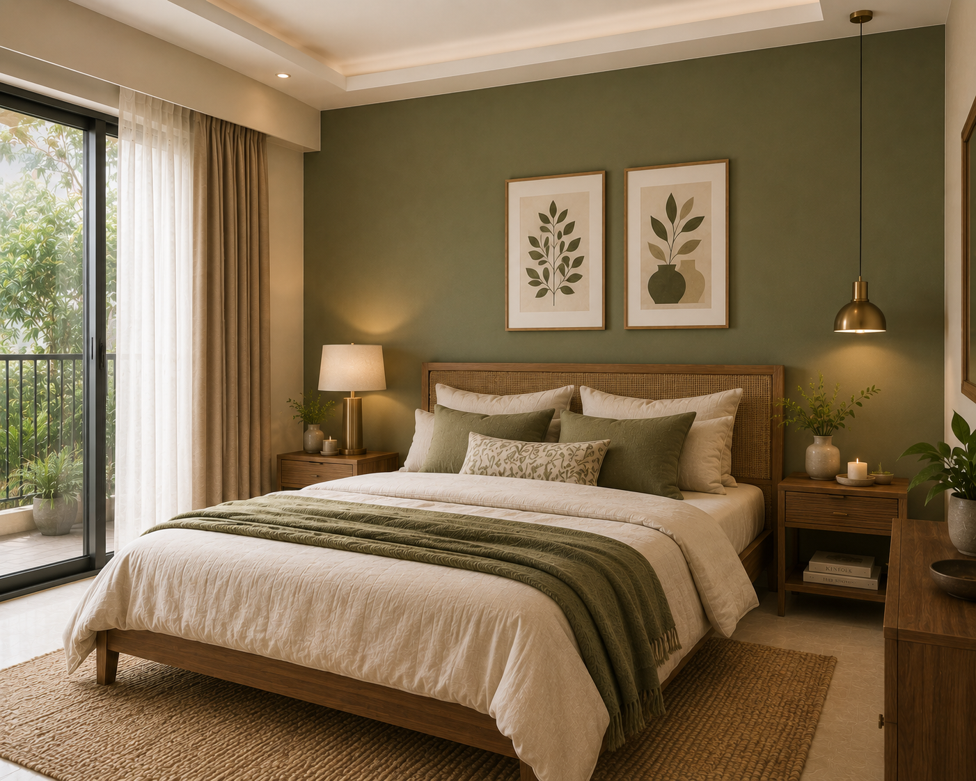
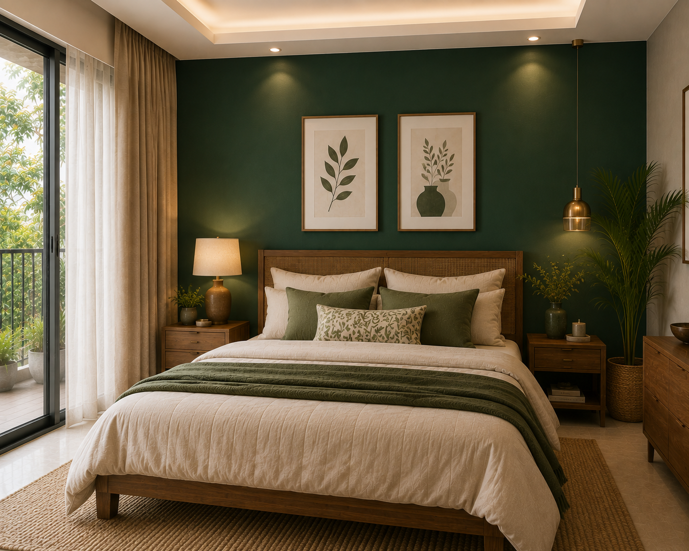
bedroom-wall-color-trends
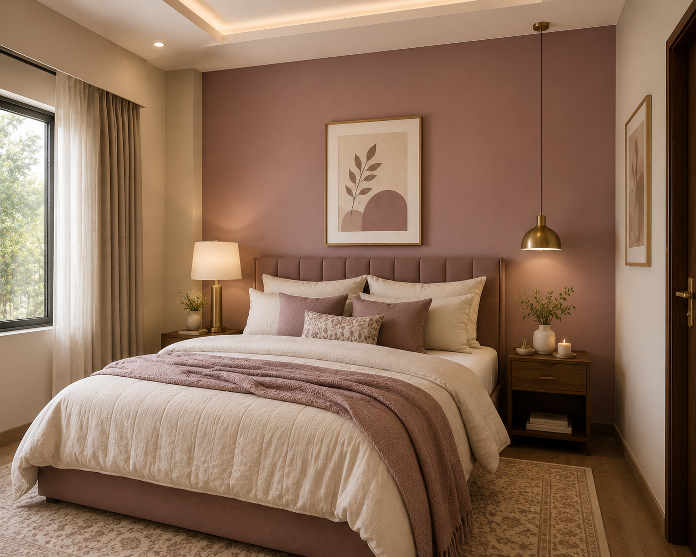
Another hugely popular bedroom combination: a warm mauve headboard wall (like Asian Paints Royale Mauve Mist) with three lighter walls — warm and soothing in both morning and night light, and lovely with brass fixtures. Colour psychology tip: cooler tones (greens, muted blues) support better sleep; save bold reds and electric blues for cushions and art, not the walls.
Dining & reading corners — moody warmth
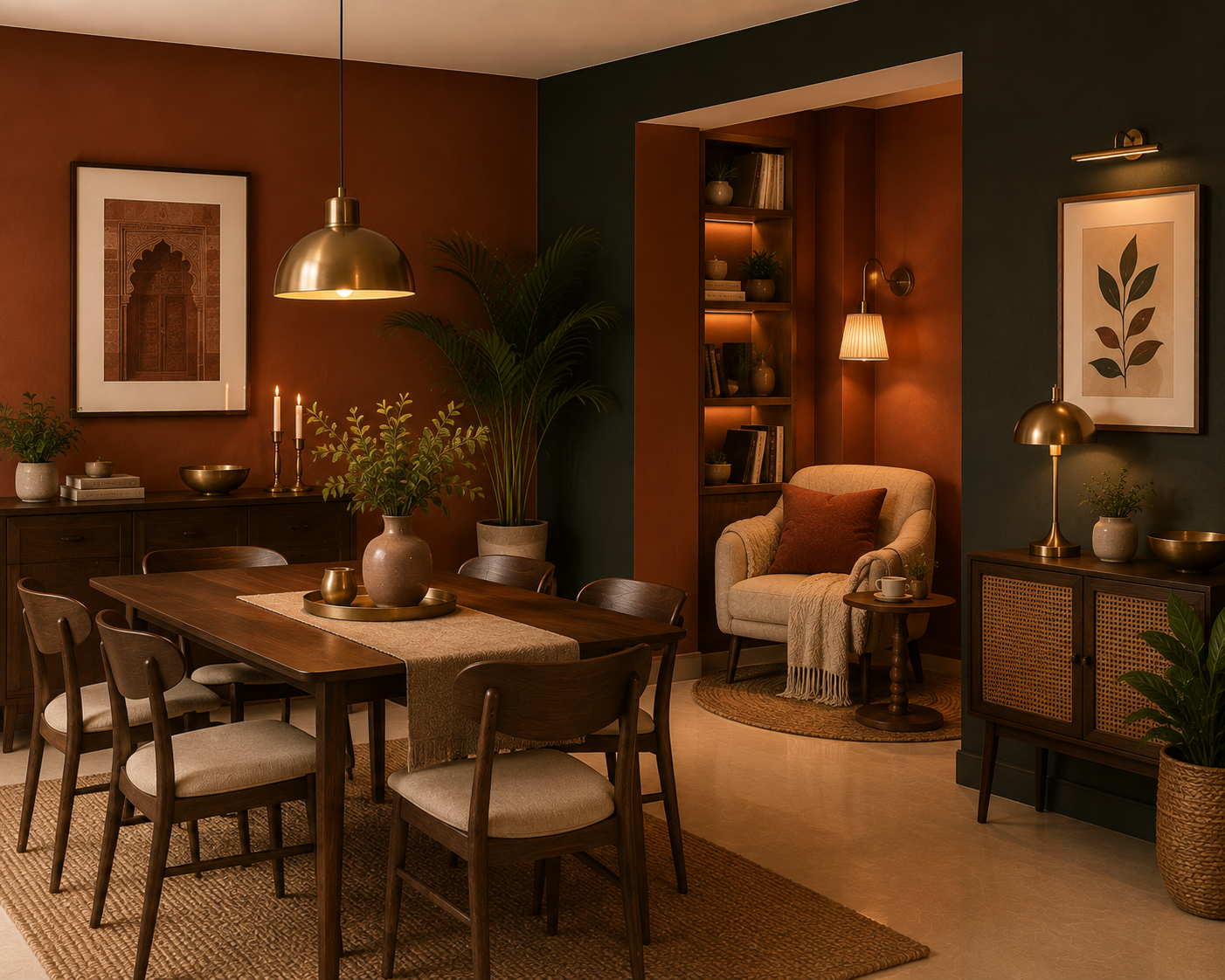
Earthy red-browns and terracotta bring cosy Indian warmth here, ideal for a snug reading nook. A single charcoal or deep-green wall adds depth and pairs well with gold or brass.
Home office — focused
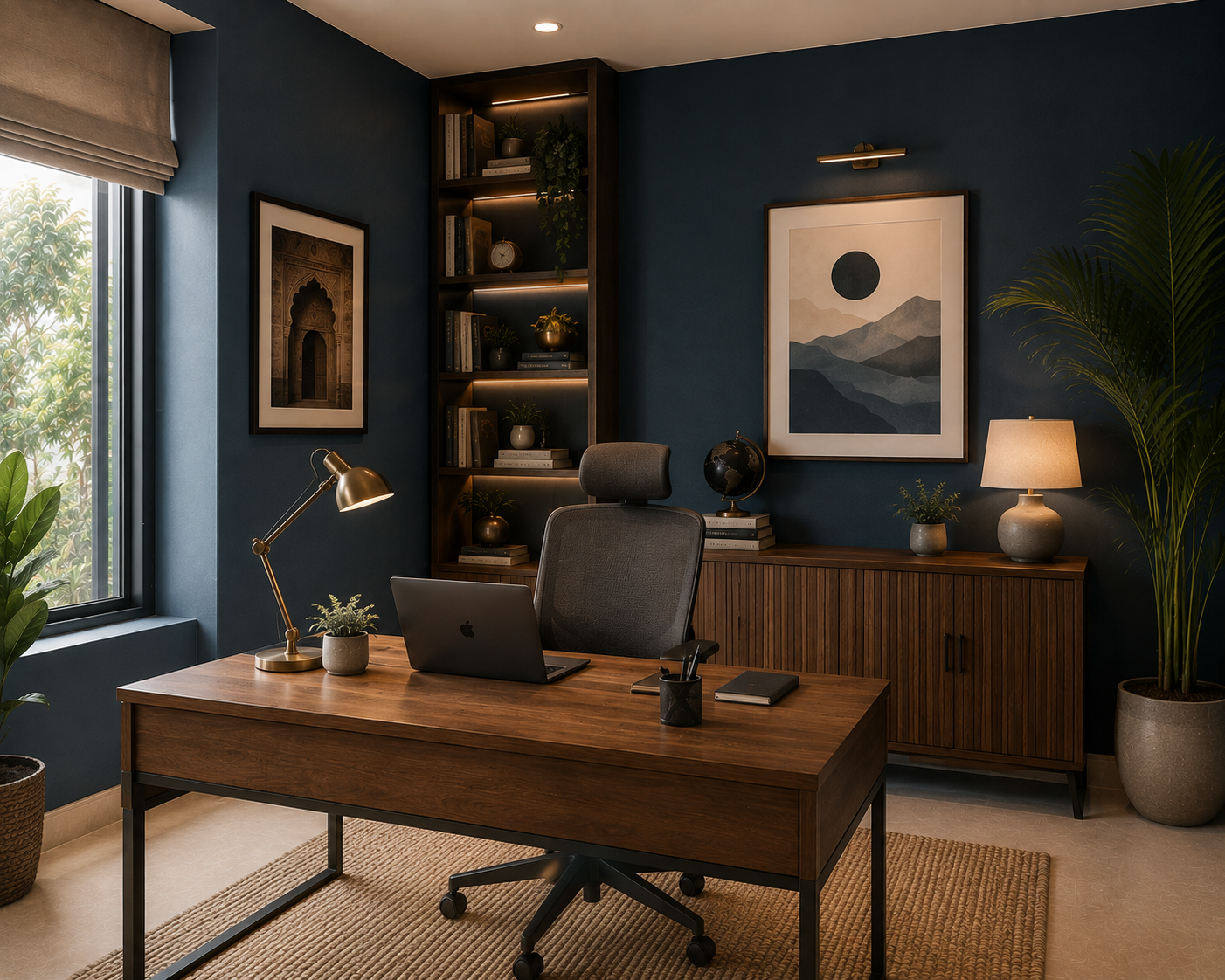
Muted, grey-based blues and deep indigo or teal work well for a home office or study — a dramatic, modern backdrop that highlights statement pieces without the harshness of a bright blue.
Small rooms & apartments — make them feel bigger
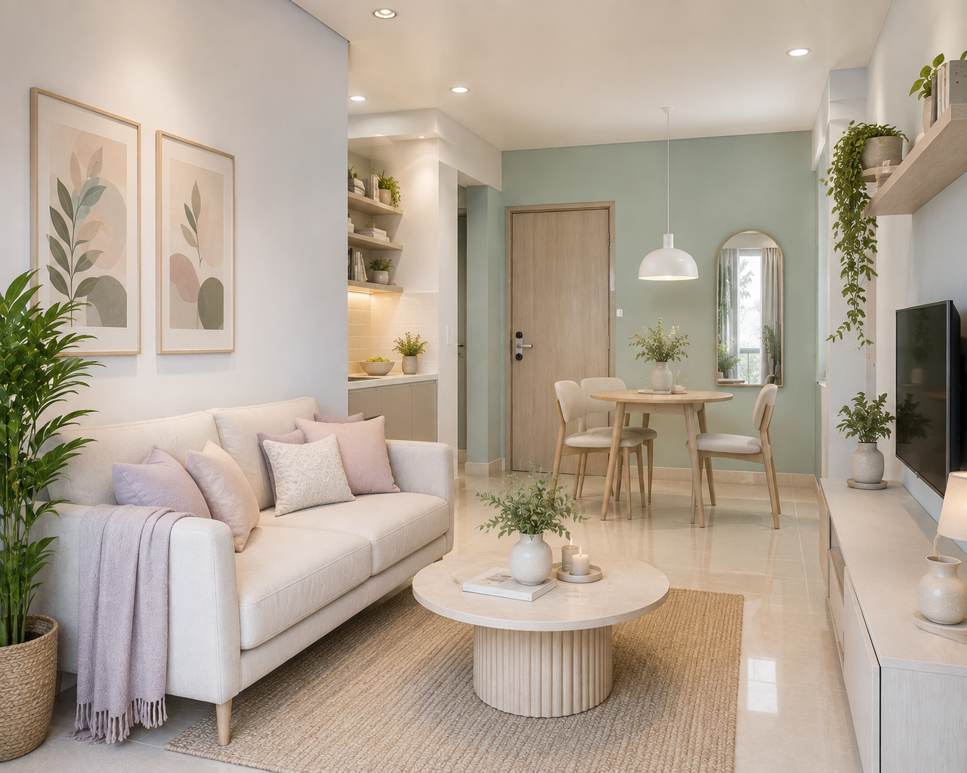
Light, receding colours — off-whites, pale greys, atmospheric light blues and pastels — make compact spaces feel larger and airier. Pastels (lavender, powder blue, blush, mint), once reserved for kids' rooms, now brighten living rooms and small apartments beautifully.
The Accent-wall Rule (Read Before You Go Dark)
Dark walls are trending — but here's the mistake to avoid. In a typical 10×12 ft Indian bedroom, painting all four walls dark green or navy feels cave-like and shrinks the room.
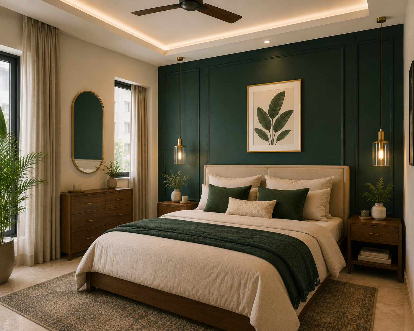
The fix that actually works: one dark accent wall + three lighter complementary walls. You get the drama and depth without the claustrophobia. Reserve the deep, moody shades for a single feature wall — the sofa backdrop, the headboard wall — and keep the rest light. Dark colour is a spice, not the main dish.
Finish Matters As Much As Colour
A detail most colour guides skip: in 2026, wall finish (sheen) matters as much as the shade. The same colour looks and behaves differently in matte versus satin.
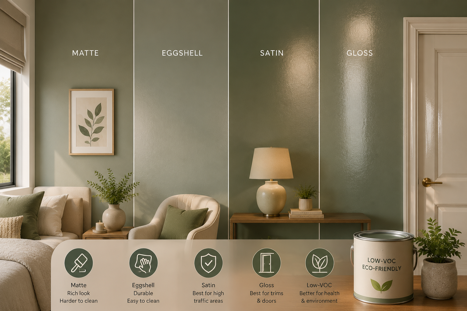
- Eggshell and satin finishes suit most interior walls — durable, easy to clean, and they hide minor imperfections. Ideal for living rooms and high-traffic areas.
- Matte looks rich and hides wall flaws but is harder to clean — better for low-touch bedroom walls.
- Gloss/high-sheen is best reserved for trims and doors, not large walls.
Pair your trend colour with the right finish and it'll look intentional and last longer. And increasingly, homeowners are pairing nature-inspired colours with eco-friendly, low-VOC paints — a genuine 2026 trend driven by health and environmental awareness.
How To Choose Without Regret
Trends are a starting point, not a rule. Before you commit:
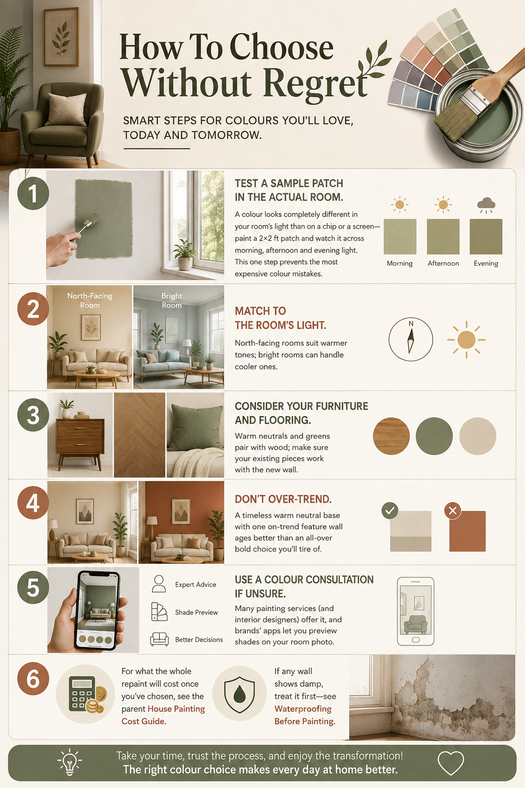
- Test a sample patch in the actual room. A colour looks completely different in your room's light than on a chip or a screen — paint a 2×2 ft patch and watch it across morning, afternoon and evening light. This one step prevents the most expensive colour mistakes.
- Match to the room's light. North-facing rooms suit warmer tones; bright rooms can handle cooler ones.
- Consider your furniture and flooring — warm neutrals and greens pair with wood; make sure your existing pieces work with the new wall.
- Don't over-trend. A timeless warm neutral base with one on-trend feature wall ages better than an all-over bold choice you'll tire of.
- Use a colour consultation if unsure — many painting services (and interior designers) offer it, and brands' apps let you preview shades on your room photo.
For what the whole repaint will cost once you've chosen, see the parent House Painting Cost Guide. And if any wall shows damp, treat it first — see waterproofing before painting.
Key Takeaways
- 2026 is about warmth — greige and warm off-whites replace pure white and cool grey.
- Nature greens (sage, olive, emerald) are the standout, especially for bedrooms.
- Terracotta and earthy warms add cosy character; muted blues replace bright blues.
- Dark accent walls: one wall, not four — all-dark shrinks a room.
- Finish matters — eggshell/satin for most walls; match sheen to the room.
- Test a sample patch in the room's own light before committing.
- Pair trend colours with eco-friendly low-VOC paint.
Myth Vs Fact
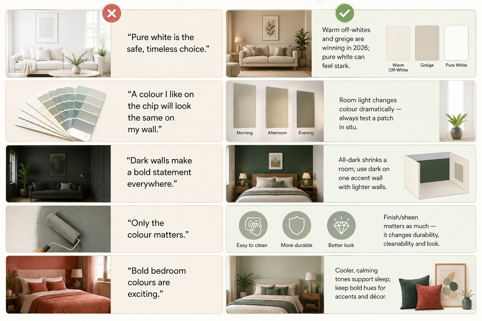
| Myth | Fact |
|---|---|
| "Pure white is the safe, timeless choice." | Warm off-whites and greige are winning in 2026; pure white can feel stark. |
| "A colour I like on the chip will look the same on my wall." | Room light changes colour dramatically — always test a patch in situ. |
| "Dark walls make a bold statement everywhere." | All-dark shrinks a room; use dark on one accent wall with lighter walls. |
| "Only the colour matters." | Finish/sheen matters as much — it changes durability, cleanability and look. |
| "Bold bedroom colours are exciting." | Cooler, calming tones support sleep; keep bold hues for accents and décor. |
Common Mistakes
- Painting all four walls a dark shade in a small room.
- Choosing a colour from a chip or screen without a sample patch.
- Ignoring the room's natural light direction.
- Picking a trend colour that clashes with existing wood/furniture.
- Overlooking finish — using flat matte in a high-touch, hard-to-clean area.
- Over-committing to a bold all-over colour you'll tire of.
- Painting over a damp wall (treat it first).
Comments ()