
Blue Your Favorite Color? Amazing ‘blue’ decor for you
Blue is a cool color that brings calmness and boosts confidence. Here are 10 ways for every true "blue" decorator to use it stylishly!
Have fun decorating with the color Blue!
Color has a strong effect on us both physically and mentally. Blue is a "cool" color that provides a sense of calmness and promotes confidence.
Here are 10 ways to decorate right with the color blue for every true "blue" decorista!
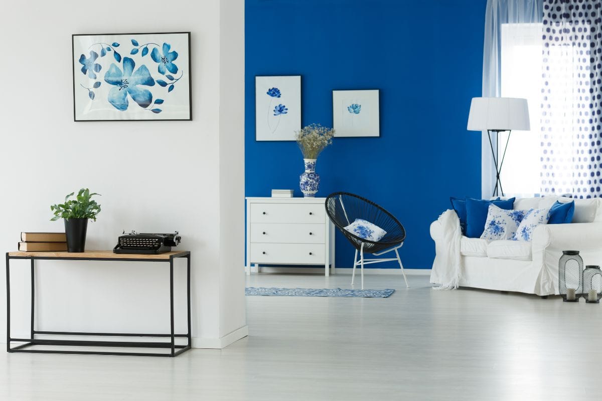
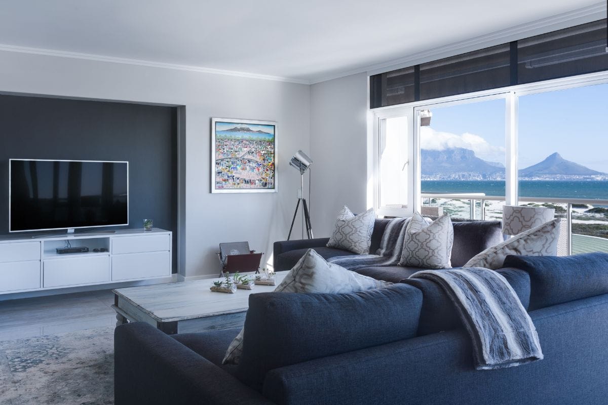
Continuity
The color scheme of your home should have a natural flow, continuity and balance, connecting the entire space. Combine the use of lighter and darker shades of blue for continuity.
Living and dining areas with continuity and color balance
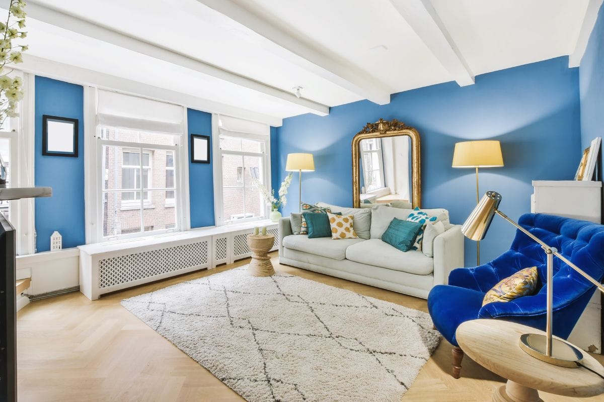
Shade
Color adds to the visual weight of a room. Darker shades are heavier compared to lighter hues. Choose from different shades of blue such as sky blue, turquoise, pale blue, gray blue, silver blue, aquamarine, teal, midnight blue etc. Pick shades that please your eye when used together.
Sky-blue living room
Secondary color
Choose a secondary color to complement blue. Color wheel can help you identify the best secondary color that flows well with the primary color. Shades of green and yellow mix well with blue. Blue and green combinations are classic, while yellow and blue achieve a cheerful twist. Follow the 60:30:10 rule i.e. 60% primary color, 30% secondary color and 10% for accessories.
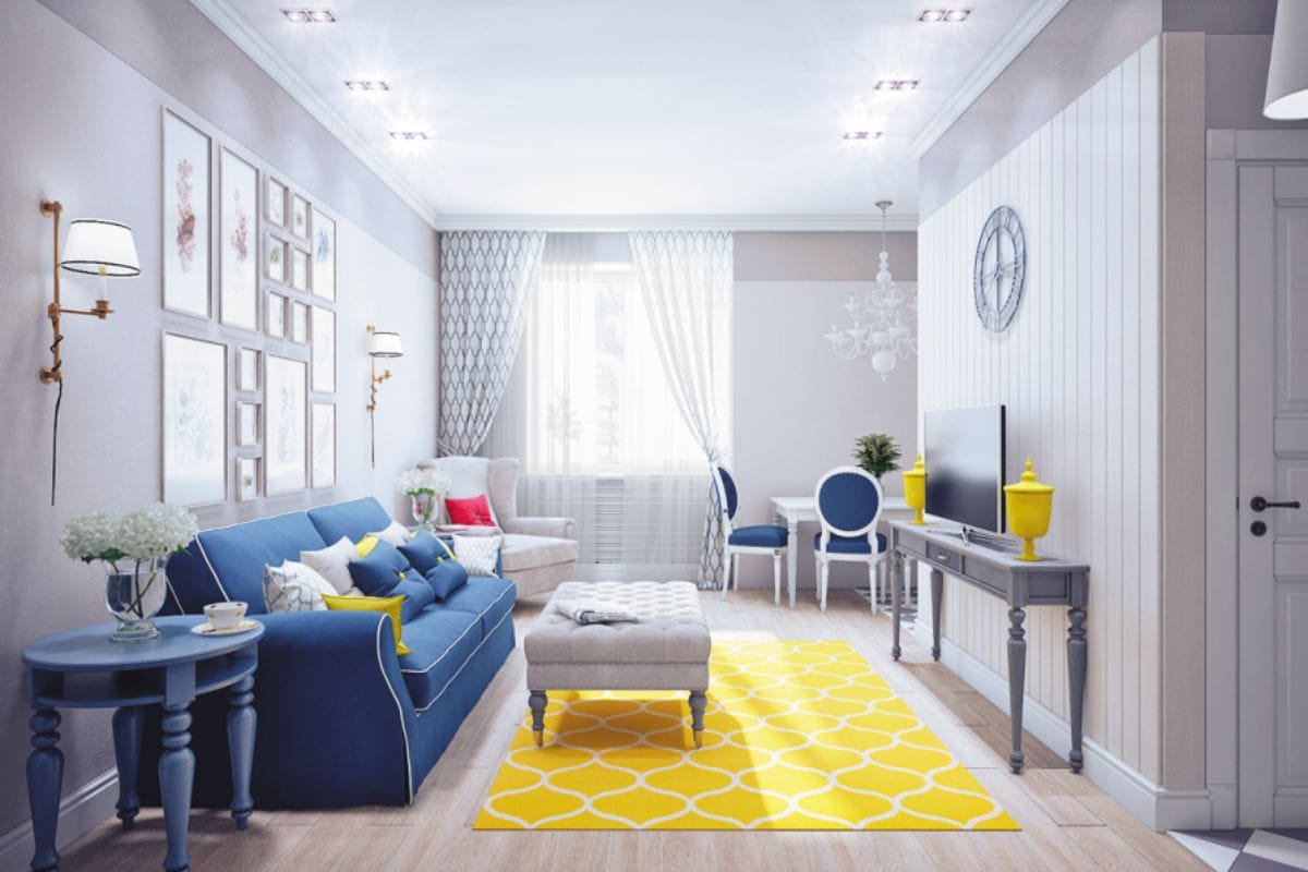
Blue, white and yellow living room Furniture
For perfect visual balance match or contrast the color of upholstery to wall paint.
Blue living room with complementary white furniture
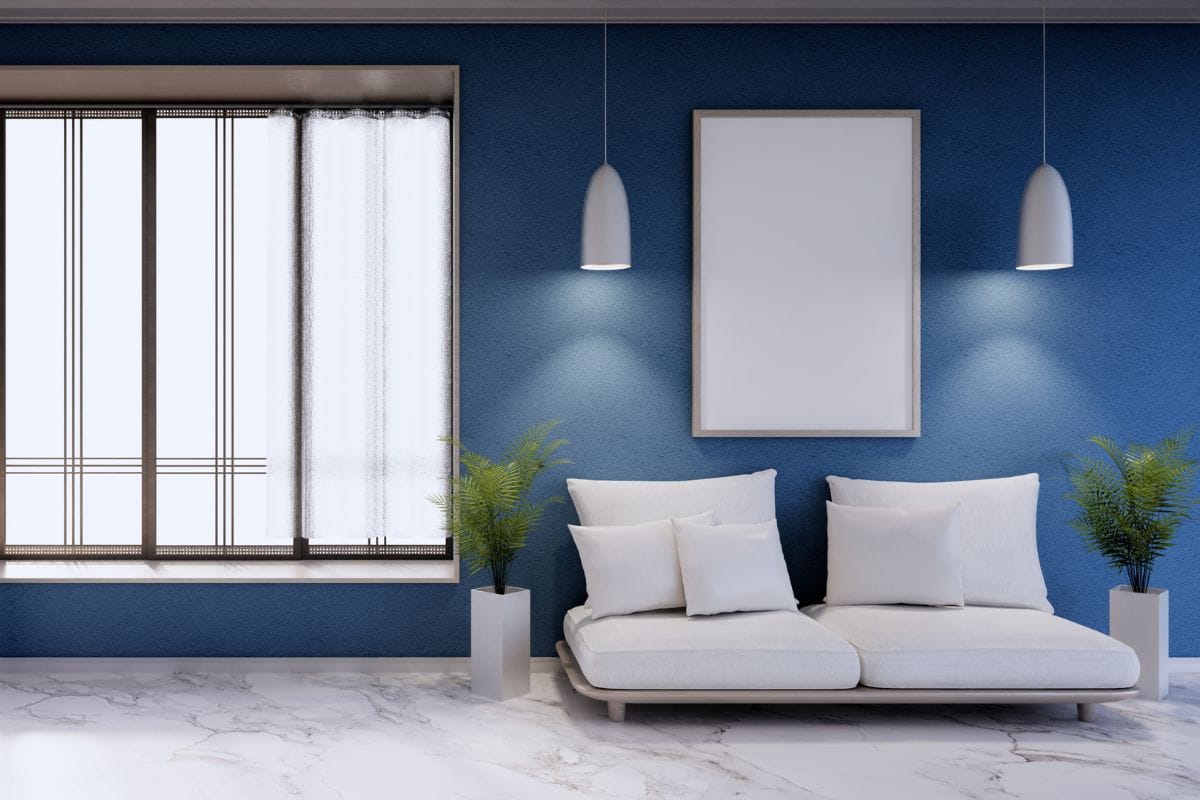
Visual Weight
Pattern and texture of drapes, pelmet, rug, cushion covers and shape of furniture, wall art all together determine visual balance of the room. Plain curtains, rugs and cushion covers, without pattern or texture, have less visual weight and flow well. Visual weight determines the look and feel of the room, while heavy patterns and textures draw attention and add visual weight, transparent or reflective surfaces and smooth objects look lighter and have less visual weight.
Living room with visual weight and flow
Drapes & Pelmet
Drapes and pelmet occupy large swathes of visual space. Drapes that are complementary to wall color achieve a more formal look while complementary colors can be used for casual chic.
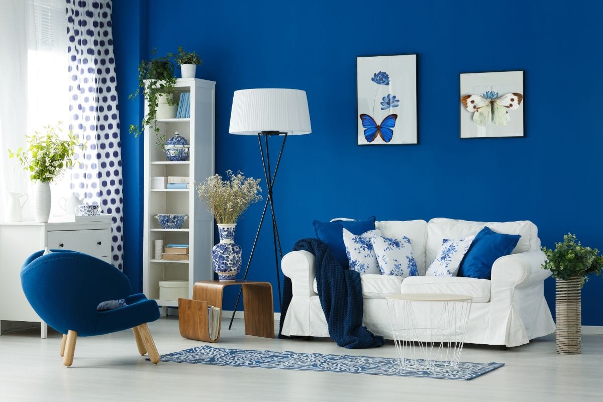
Harmony
Create harmony within the room by making all the elements work together to enjoy the feel of calm and tranquility. Use a single shade of blue, in varying textures to decorate an entire room to create harmony.
Contemporary blue living room
Photo Frames/ Gallery wall
Size, shape and color of photo frames come together to enhance the beauty of a gallery wall. White or gold frames go well with shades of blue. To create contrast use yellow! Another idea is to collect blue decorative pieces and display in a white frame.
Contrasting round yellow frame on cool blue wall
Blue colored butterflies secured in white frame
Accessories
Accessories you use should go with the theme of decor used in a room. Few accessories such as potted plants fit everywhere but it still pays to be careful with the size, shape and color of the pot.
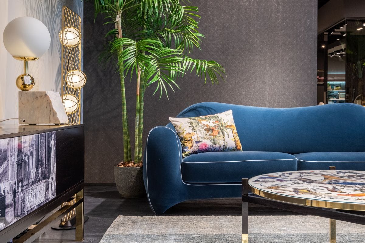
Large potted snake plant and elegant sofa
So, dare to choose blue for interiors in your next interior redesigning project.
Comments ()